Tuesday 14 May 2013
Monday 13 May 2013
Evaluation of Fashion Project
During this project we have been exploring this idea of gender identity, the refusal to conform to a standard, the evolving trend of Androgyny in the Fashion Industry and how the masculine-feminine boundaries have blurred. From this project I think that I have a better understanding of the term "androgyny" and other terms such as "Gender Identity". The positives I can draw from this project are that I thought that we had a good concept, I thought the research was good and does somewhat visually translate our ideas into our final images, I thought that our final images are good and I thought that sometimes we worked as a group and I felt that I have pulled my weight in this project because of my contributions to ideas for various elements of the project, I have always been on time and ready to start and I have contributed to this project through Health & Safety, Budget, Organisation of Digital Files . However, Things I felt could of been improved on was testing because I believe there was not enough testing, the group could of worked together much better, casting could of been improve on, I felt that things kept being changed, especially the set which had quite a negative effect on our ability to have confidence in our ideas Moreover, I found this project to be difficult and frustrating because of the group that I was with because there was a lack of attendance in tutorials and workshops / the other group members were constantly late from the very beginning , and not ready to start, certain group members did not deliver on tasks that were assigned to them and I had to keep asking them to do it and during the production week I thought that the group was somewhat unorganized and we were running late with the construction of the set. I think this project has caused a lot of unnecessary stress and worry on myself and I think that if was with any other group for this project, these things would not of happened and the project would of gone a lot more easier and smoother.
Editorial Layout
This is our Final Editorial Layout for this project:
With this editorial layout we wanted a variety of types of images that included still-life, portraiture and full body shots our reason behind wanting to do this was to break up the series so it was not so repetitive . We decided that with out final layout that we wanted a variety of different angles of the sculpture again to make the series not so repetitive. We thought to have the jumpsuit image as a double page spread because we felt that this image was more of a landscape and because of the negative space in the image. We decided to put the dress and coat image together because of the central composition they both share and finally we decided to put the blurred image and the image of the 4 fabric images together because we felt that worked well together because of the unusual nature of both of the images.
With this editorial layout we wanted a variety of types of images that included still-life, portraiture and full body shots our reason behind wanting to do this was to break up the series so it was not so repetitive . We decided that with out final layout that we wanted a variety of different angles of the sculpture again to make the series not so repetitive. We thought to have the jumpsuit image as a double page spread because we felt that this image was more of a landscape and because of the negative space in the image. We decided to put the dress and coat image together because of the central composition they both share and finally we decided to put the blurred image and the image of the 4 fabric images together because we felt that worked well together because of the unusual nature of both of the images.
Editing
After our production week, the next step is editing our photographs and putting together the layout of our editorial 6 page spread:
 For this image, the editing that needed doing is mostly to the thumbs of the model because they look odd and we need to retouch the loose strands of hair, retouch the structure and to colour correct the image, this is the final retouched image:

 For this image, the editing that needed doing is to extend the background and the floor, retouch the floor, retouch the loose strands of hair and to colour correct the image, this is the final retouched image:


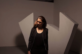
For this image, the editing that needs to be done is mainly to extend the background to get rid of the unsightly stands, polyboard, ceiling and pole in right hand corner. Also, to change the head of the model because we did not like the head position, to retouch the structure and the floor and to colour correct the image. This is the final retouched image:

The next images to edit, did not need a lot of work done to them:

For instance this image we wanted to blur, so all that needed to be done on this image was to apply a blur to it and colour correct the image, this is the final retouched image:

Also, for this image, we only needed to colour correct these images:


This is the final retouched image:

During the editing process I had said to the group to work non-destructively uisng masks, however I felt that I was being ignored and they continued to work destructively by affecting the actual pixels, I believe that this will be brought up during the assessment of this project.
Images that were rejected from the final edit
Coat


These images for the coat rejected because we thought that the two first images we did not like the midriff being shown and we thought the third images as too much of a crop
Dress


These images were rejected from the final edit because of the focus on the face being too soft and we felt that the hair was too much.
Jumpsuit


These images were rejected from the final edit because we felt that we preferred the body position in our 1st choice.
Jacket

These images were rejected because we thought that our first choice image looked better for blurring.
Fabric


 From this series we rejected every other image except these for images because we thought that these worked the best.


For this image, the editing that needs to be done is mainly to extend the background to get rid of the unsightly stands, polyboard, ceiling and pole in right hand corner. Also, to change the head of the model because we did not like the head position, to retouch the structure and the floor and to colour correct the image. This is the final retouched image:

The next images to edit, did not need a lot of work done to them:

For instance this image we wanted to blur, so all that needed to be done on this image was to apply a blur to it and colour correct the image, this is the final retouched image:

Also, for this image, we only needed to colour correct these images:


This is the final retouched image:
During the editing process I had said to the group to work non-destructively uisng masks, however I felt that I was being ignored and they continued to work destructively by affecting the actual pixels, I believe that this will be brought up during the assessment of this project.
Images that were rejected from the final edit
Coat


These images for the coat rejected because we thought that the two first images we did not like the midriff being shown and we thought the third images as too much of a crop
Dress


These images were rejected from the final edit because of the focus on the face being too soft and we felt that the hair was too much.
Jumpsuit


These images were rejected from the final edit because we felt that we preferred the body position in our 1st choice.
Jacket


These images were rejected because we thought that our first choice image looked better for blurring.
Fabric


Contact Sheets from Shoot Day
These are the Contact Sheets from our Shoot Day:
We decided to reject Shots 5 & 6 because we felt that the Shots with the hood the fabric looked too heavy on the model and the shots looked too religious and we felt that if we used the shots of the structure in the final edit it would too repetitive
We decided to reject Shots 5 & 6 because we felt that the Shots with the hood the fabric looked too heavy on the model and the shots looked too religious and we felt that if we used the shots of the structure in the final edit it would too repetitive
Shoot Production Week
For our Shoot Production week, we will be constructing our set, photographing our set with our model on our Shoot Day and at the end of the week shall be breaking and cleaning the set:
The Process:
•We constructed an symmetrical abstract sculpture
•We made a frame first so that the sculpture would have something to be built around and to keep it up right.
•We then built the actual sculpture out of poly boards, making the whole sculpture 3D
•To get the concrete effect we used plaster as it was easy to manipulate it to make it look like concrete
•We then painted it a light grey to represent actual concrete.
At first we wanted a flat sculpture with no back to it:


But then it was suggested to have a 3D sculpture so that it would be easier to move around with the camera, have the model in different places and get more interesting angles with the shots


This is the floor plan for our set with the measurements:

These are the results of the shoot unedited:


In terms of Aperture the majority of the shoot was taken with a small aperture around F4 to F5.6 and in terms of shutter speed was no faster than about 1/125.
Risk Assessment, Budget and Call Sheet
This is the Risk Assessment for our group:
As we had kept changing our minds about the set, it was hard for me to keep up with the risk assessment and so we changed the colorama background to using a white wall, with a large white canvas attached to it and painted the floor grey instead of white which meant that we did not properly risk assess which is just not good enough.
Also this is the Budget for this project:
On this project we have a budget of £350. 45, and we overspent by £17.96
Also, this is the call sheet for the production week:
Subscribe to:
Posts (Atom)